I’m No Illustrator

Bharat Restaurant

I’m no illustrator but I seem to be doing quite a lot of photo-realistic visuals for clients at the minute.

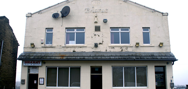
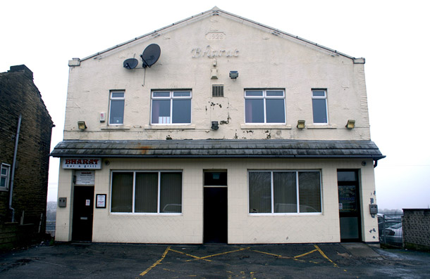
Now I will confess, I am not the worlds best art worker by any stretch but sometimes I am a little proud of my efforts which is why I have saved a couple of images at key steps in this restaurant renovation below. It will hopefully give you an idea of the effort that goes into visual mock ups for jobs like sign fitting.


Bharat Restaurant

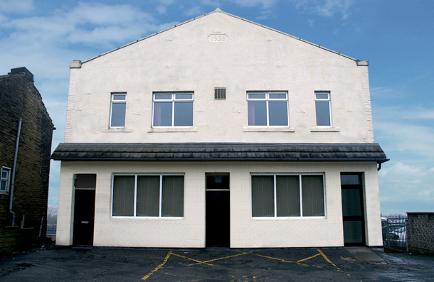
Step 1. Centring and aligning the original image to be worked on.


Bharat Restaurant

Step 2. Brighten the place up a little by removing the old fixtures, fittings and a little blue sky.


Bharat Restaurant

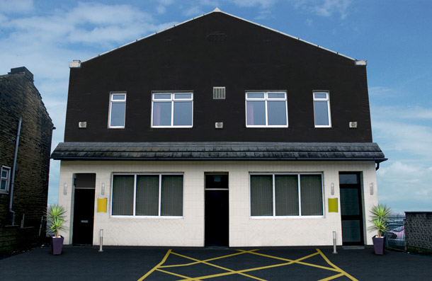
Step 3. Consider you design options and make a splash. We’ve added more paint and cleaned up the drive way.


Bharat Restaurant

Step 4. Now we can start to dress. We’ve added lighting, menu boards and greenery.


Bharat Restaurant

Step 5. Window vinyls will help.


Bharat Restaurant

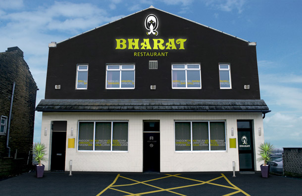
Step 6. The big one.


The design may not to be everyone’s taste, but the aim with a visual of this kind is to inspire our client and show them a realistic impression of what they could and should look like. The external changes are now underway at the Bharat Restaurant in Bradford and hopefully the exterior should start to match the quality of their authentic Indian cuisine.


Posted in Digital Design | Tagged | Leave us a comment

Now That’s What ‘We’ Call Music!

Record Collection

Have you ever considered how the humble design studio keeps trundling along without fail, day after day. Even the most demanding clients struggle to bring the mood down in this crazy world… Well I can tell you that we have the answer, and it’s all in the music!

The recent launch of the new Dulay Seymour website raised quite a musical debate in our very own studio. We were asked to answer some simple questions about ourselves to create mini profiles for the new site. The social quiz included the classic ‘Your Favourite Record’, to which eyebrows were instantly raised as we pondered whether it was possible to select one record and give it the title of ‘Favourite’.

Here in the Dulay Seymour work house, we love our music. Our photography studio is lined with records, old and new of all genres. So we approached this question with great respect along with a sense of internal competition, who could say the name of one record that would have everybody’s approval.

We delayed, switched tactics and grew frown lines whilst trying to whittle our music down. Did we go mainstream for the popular vote or did we slide ‘Leftfield’ into obscurity and give the impression that we were cultured beings? This wasn’t an easy task and left us in a dark place. Some of us caved in and selected three but some stayed strong a placed one record above all others.

Truth be told, we couldn’t let this matter lie and that is the reason for this blog entry, we have whittled down hundreds of records and created a must have list of twenty. I’m sure you’ll agree with most and disagree with some, but either way I’m sure you’ll have fun talking through this list.


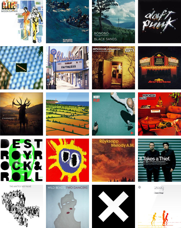
Top 20 Album Covers

Here are our top twenty must have studio records:

  • Moon Safari – Air
  • Since I Left You – The Avalanches
  • Black Sands – Bonobo
  • Discovery – Daft Punk
  • White Ladder – David Gray
  • Sunday 8pm – Faithless
  • Goodbye Country (Hello Nightclub) – Groove Armada
  • Verse Bridge Chorus – Kinobe
  • Resist – Kosheen
  • Lost Horizons – Lemon Jelly
  • Play – Moby
  • Big Calm – Morcheeba
  • Destroy Rock & Roll – Mylo
  • Screamadelica – Primal Scream
  • Melody AM – Royksopp
  • It Takes a Thief – Thievery Corporation
  • Rules – The Whitest Boy Alive
  • Two Dancers – Wild Beasts
  • Self Titled – XX
  • Simple Things – Zero 7


Posted in Design, Fun, Music | Leave us a comment

New Look Dulay Seymour Goes Live

Let's Make Things Interesting

“A Decorator’s House is Never Finished” and not for one moment has a phrase been truer and held as much relevance for us here at Dulay Seymour. We’ve had meeting after meeting, followed by design after design, the development of our own website has outlived staff members and now, it has finally gone live.

This week marked a significant event for us here at Dulay Seymour, we completed and launched our new look website. It has taken a lot of pulling together and been a struggle to complete alongside client work but the full team are proud of our combined efforts and finally feel thrilled to direct people to our new digital home.

As we know the wheel never stops turning and as the site was being uploaded, I wanted to amend the HEX code of a 1 pixel line break. I guess the beauty of our new site layout is the room for expansion, so keep an eye open for on going developments. We now have a solid base to launch from but we intend to make things truly great.

Check out the latest work and news at www.dulayseymour.com

Posted in Design, Digital Design, General News | Leave us a comment